☰
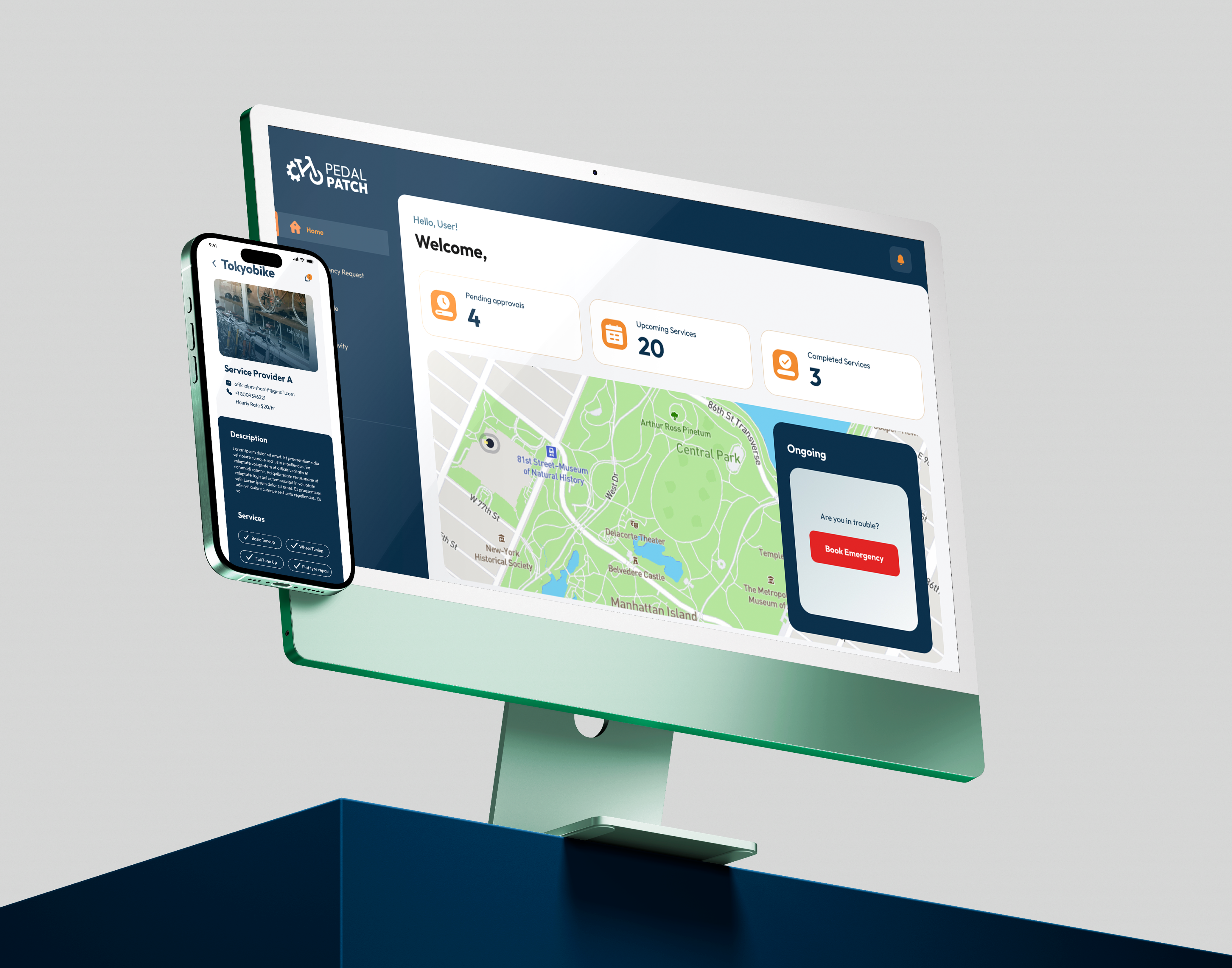
PedalPatch is a smart, mobile-first app built for urban cyclists. It offers personalized bike routes, real-time updates on road conditions, and easy access to nearby repair shops, events, and safety alerts. The app is designed to enhance everyday cycling by combining functionality, convenience, and community in one user-friendly platform.
Cyclists often face challenges navigating city streets due to the lack of centralized information. From unsafe or blocked roads to difficulty finding nearby repair services or cycling events, riders are forced to rely on multiple sources, leading to confusion, delays, and sometimes unsafe situations.
PedalPatch brings everything a cyclist needs into one place. With features like curated route suggestions, real-time hazard notifications, and geo-based access to services and events, the app creates a streamlined, safer, and more enjoyable cycling experience for riders of all levels.

The typeface used is Montserrat, a modern, geometric sans-serif font that conveys professionalism and clarity. "S" in the logo is a key visual element symbolising routes and locations. The circular element within the "S" resembles an eye, hinting at observation.

Both typefaces were carefully chosen to complement and reflect the essence of the brand, creating a seamless and user-friendly interface.

Main font

Body font
were carefully chosen to reflect trust, professionalism, and energy. These colors establish a strong visual identity while maintaining approachability and clarity.
this palette ensures a clean, structured, and emotionally engaging experience, reinforcing the brand’s connection to health, clarity, and efficiency.

chat section

Buttons

Footer

cards

Side Card
icons

card

input fields